

The Backstory of Stevenson’s Company Logo
Taking a look at a specific aspect of the company is always an interesting venture after immersing yourself in it day after day. Such an exercise stirs up the memory of where we came from and gives an idea of the direction we are headed.
In August 2017, I decided it was time to give the company logo a new look. To me, the logo seemed a bit heavy and it no longer reflected the vision I aspired to.
The old logo truly represented the company before I took over. Scott, the former owner, has a real passion for fly fishing. I believe he actually gives courses on the subject in the summer. The logo resembled a fishing fly, with its long red and yellow feathers, and a few blue streaks, which are attached to the end of what is supposed to be a hook, but is in fact a pencil tip. The idea was to combine the previous owner’s two passions, fly fishing and writing. The name of the previous owner and also the team of “writers,” who gradually joined him over the years, were displayed under this flamboyant logo..
Repositioning while retaining the former owner’s brand
This is how Scott started out, plain and simple. He saw that there was a real need for improvement in English texts, and with his training as a journalist and experience in writing, he launched the company. Over the years, he steadily built a client base and forged a strong reputation that, in 2012-2013, led him to approach the organizing committee of the Canada Summer Games—Sherbrooke 2013 to offer his company’s services. The translation needs of the committee were almost exclusively from French into English. Since the company had a solid reputation and was composed of English-speaking employees, it was positioned as the ideal partner for the incredible adventure these Games represented.
It was precisely in this period, right in the middle of the Canada Summer Games, that I arrived on the scene. In 2017, the founder of the company was no longer in the picture. I had new employees and offered an enhanced, better quality, and more diversified service. I implemented proper translation tools and my expectations were higher than ever for many reasons…. The end result was that I felt that my logo, because it had become my logo, was no longer the right fit.
Make room for professionals: Master Translators
Since I was focusing on meeting new clients and wanted an image that really represented who I am, I hired a company from Sherbrooke to come up with a few ideas. I told them about the history of the logo and my vision of the service I was providing. The idea of the fishing fly simply didn’t suit me. There was nothing that demonstrated that we were translators, nor that we were professionals in the industry. I pondered for a long time on my strategic positioning statement. It took two years and I am absolutely convinced that the end product perfectly describes our services. So I let the designers know that I wanted “Maîtres traducteurs / Master Translators” in my logo. I also chose to keep the founder’s name for two reasons. First, because of the company’s solid reputation, and second, to show clients that we are people who are translating… not computers… not systems… not photocopiers… people, flesh and bone, in deep thought, asking questions and finding solutions, united in a team.
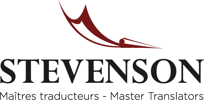
A new emblem, striking yet humble
After a few drafts and some back-and-forth, the new logo arrived to see the light of day. A striking, refined, and lighter version of the logo prevailed to take its place in my heart and spirit. A quill pen giving the impression that a message has been sent and is arriving at the right moment, a definitive thrust forward… a translation right on time.
The name speaks to me and reminds me of where the company has come from, that if Scott and I had not crossed paths, well I wouldn’t be here today. I am struck by the position statement more and more with each passing day. Impeccability is what I have been striving for since I began as a translator. If you were aware of the amount of questions that we ask ourselves while translating a text, you would surely be shocked. If you also knew how long it takes to translate, you might be at a loss for words. Fortunately for us at Stevenson, we live for translating and editing, so they don’t feel like work at all….
Leave a Reply